Review – The Cult of Undesirables
Hello, I wanted to submit the Beta comic of “The Cult of Undesirables” for review! You see I am really trying hard to establish myself as a webcomic artist, and I desperately want to get better.
The comic will feature Numerous same-sex relationships and a person of color main character Here is the link to the comicThe Cult of Undesirables follows the story of the Pariah, a social class of outcasts that were deemed too small, too crippled, or too weak to glorify the city-state of Garas Daraghon through battle. Perfection, in the city, is paramount. As we follow the stories of the Pariahs, however, we discover that perfection is more than it is understood.
The comic does have a bit of nudity and is “mature” but it is NOT the focus of the comic. And so far only 3 pages feature nudity.
Hey, you know you can get custom consultations done at my patreon? It’s true! It’s damn true! But I’m in the right mood, so let’s do this “beta” that’s longer than Dark Science (not that that’s a feat, but…)

Before I look at the comic proper, this looks like shit and I can’t read it. Add this to your CSS stylesheet right now.
.heading, .headingsub, .headingsub a {
color: #fff;
text-shadow: -1px 0 black, 0 1px black, 1px 0 black, 0 -1px black;
}

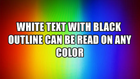
Honestly, that’s still not great, but at least I can read it. (I also made “The Undesirables” bold)
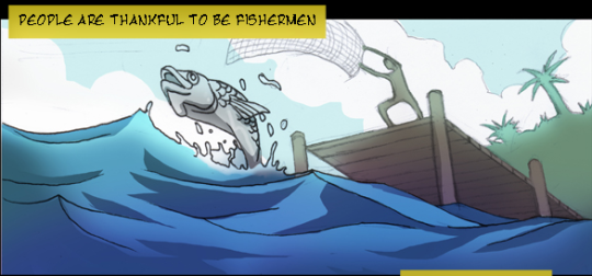
And while we’re on the subject of fonts, why is your text so scratchy? And, not to get too pedantic here


This is all one narration.
In comics, it can be difficult to establish who’s talking when characters aren’t onscreen. One solution is coloring the narration boxes.
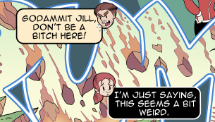
In Loth, I had little chibi heads next to Riley and Jill’s first lines
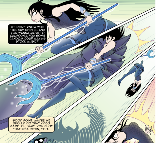
And in the next page, we know who’s saying what line because the colors are consistent (and the context, of course).
But you’re just kind of changing the colors because? You’re keeping it consistent on any one page, but you change it every page and it doesn’t mean anything. Fine a color and stick with it. Also, I read all 50-odd pages of your comic and I still don’t know who was talking. Should I?
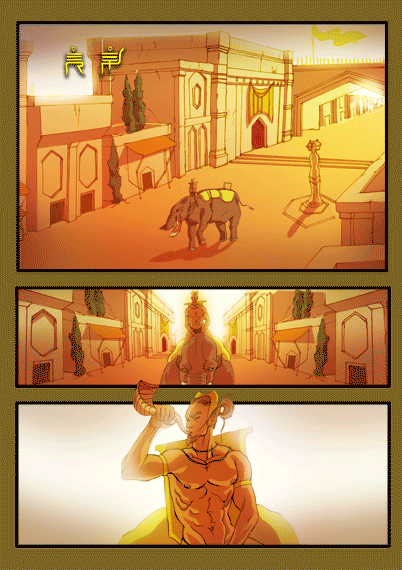
This page is way smaller than all the other pages and I don’t know why. I found it amusing, though.
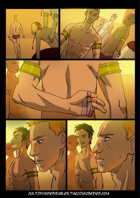
So, the hero of the story seems to be this guy, Tyfon, whose joined the army, but will be made a slace is anyone finds out he’s missing fingers. He hides this by cleverly, um…. Well maybe no one will try to shake his hand
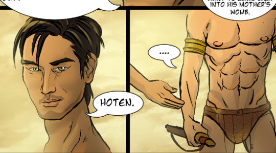
Oh.
I feel like this page needed an extra panel (there’s a scene cut after this one) to make it clear Tyfon, ignored the handshake request. Maybe Hoten being all “Okay, guy” to make it clearer. Because this was the end of the page, I thought it was meant to be dramatic. “How will Tyfon escape this predicament!”

Hoten reveals that the warriors are all gung-ho about having hands and this hero deserves to get made a slave. He didn’t even put gloves on! What’s his plan, here?
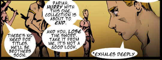
“*Exhales deeply”. Not even a second asterisk to close it.

Anyway, Tyfon’s plan fails because of fucking course it fails and I really can’t feel bad for Tyfon because come the fuck on.
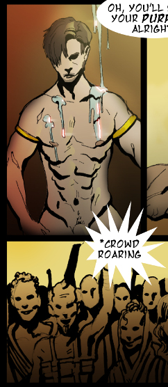
To the *Roaring of the crowd, Hoten undergoes the sacred rite of the Paragons and Tyfon is made a slave. I think that’s meant to look like that?
There’s also a subplot about a dude pretending to be a kid to get out of going to the army, but that hasn’t paid off yet.
But, yeah, Tyfon’s such a goddamn fucking moron I can’t really sympathize with him as a protagonist. He was warned that he’d be made a slave if people saw his hand and he made comically little effort to trick the paragons.
So, yeah. That’s my first-pass review of the comic. You’ve spent a lot of time on the world-building, but I’m not going to give a shit unless I like the characters. Literally the only character trait Tyfon’s exhibited is “dumb as a box of special needs shit”, which isn’t a particularly likable one. We need less exposition, more characterization! And also less Unsound Effect dialouge!

Discussion ¬